The Clove Club — Website Redesign
Website · UX/UI DesignThis project focused on redesigning The Clove Club website to deliver a cleaner, more intuitive user experience across four pages (homepage + three supporting pages). The redesign addressed key usability and accessibility issues, improved readability and navigation, and introduced richer visual content to better reflect a premium dining experience.
Challenge
Redesign a website with a focus on creating a seamless UX/UI across four pages. Identify and solve seven core pain points through detailed design solutions to improve usability, clarity, and engagement.
Goal
Transform the website into a user-centric platform that meets (and ideally exceeds) user expectations by delivering intuitive navigation, strong visual hierarchy, accessible design, and efficient functionality across all redesigned pages.
Target Audience
Who the redesign is forThe experience was designed for high-income diners in Baby Boomer (1943–1964) and Gen X (1965–1979) demographics, who prioritize high-quality service, excellent food, and memorable experiences.
- Income: $150,000+ annually
- Careers: CEOs, doctors, engineers, architects, entrepreneurs
- Brand affinity: Louis Vuitton, Gucci, Yves Saint Laurent, Dior, Burberry
- Dining preferences: premium service, strong ambiance, and a mix of familiar + innovative options
Key Pain Points
Issues identified in the existing site- No clear introduction for first-time visitors (who The Clove Club is, what makes it special).
- Animated/moving blue background distracts from content and reduces readability.
- Low contrast causes white text to be difficult to read against the background.
- Navigation labels and hierarchy are unclear, increasing friction.
- Serif typography reduces legibility for longer reading and smaller screens.
- Little-to-no imagery (food, ambience, team), weakening emotional appeal.
- Menus link to PDFs with limited context and no embedded visuals.
Solution
What changed and whyThe redesign introduced a clearer structure and premium editorial feel while improving usability and accessibility. The approach focused on four pages: a reworked homepage and three supporting pages (commonly: Menu, Reservations, and About). Seven pain points were addressed through strategic UX/UI improvements:
- Clear introduction: strengthen the above-the-fold message with a concise value proposition and credibility cues.
- Reduced distraction: remove motion-heavy backgrounds; use subtle texture/imagery that supports content.
- Improved contrast: apply accessible color contrast and overlays to ensure readability.
- Simplified navigation: use clear labels, consistent layout, and logical page hierarchy.
- More readable typography: adopt a modern, legible type system with purposeful sizing and spacing.
- Premium visuals: introduce food and ambiance photography to increase trust and emotional engagement.
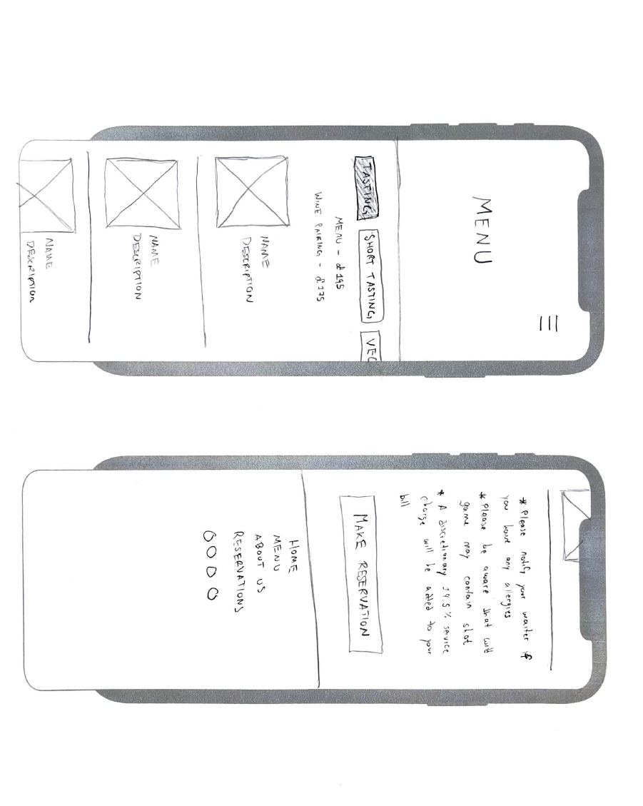
- Menu experience upgrade: replace PDF-first experience with an on-page menu (with images), keeping PDF optional.
Pages Designed
4-page scope- Homepage: clear positioning, visual hierarchy, primary CTA emphasis.
- Menu: on-page browsing with visuals; improved structure and scanning.
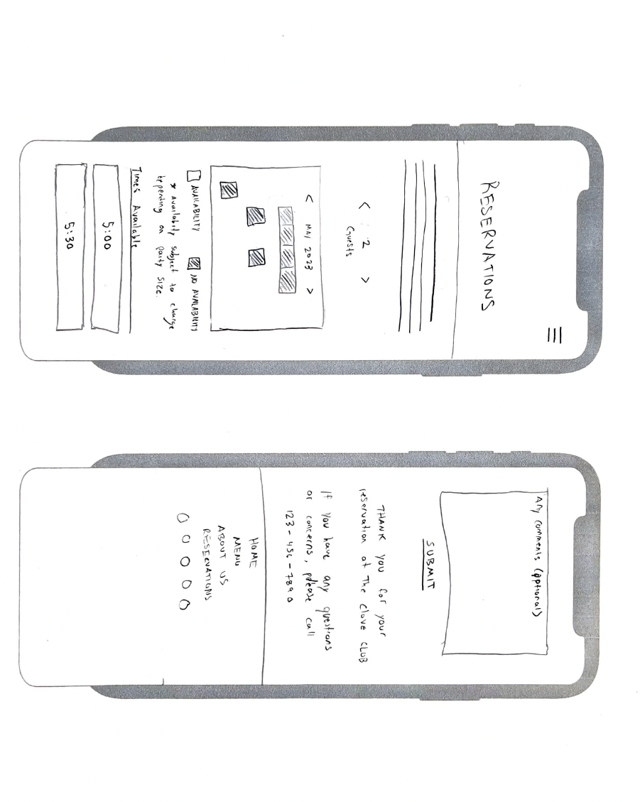
- Reservations: streamlined booking flow and reduced friction.
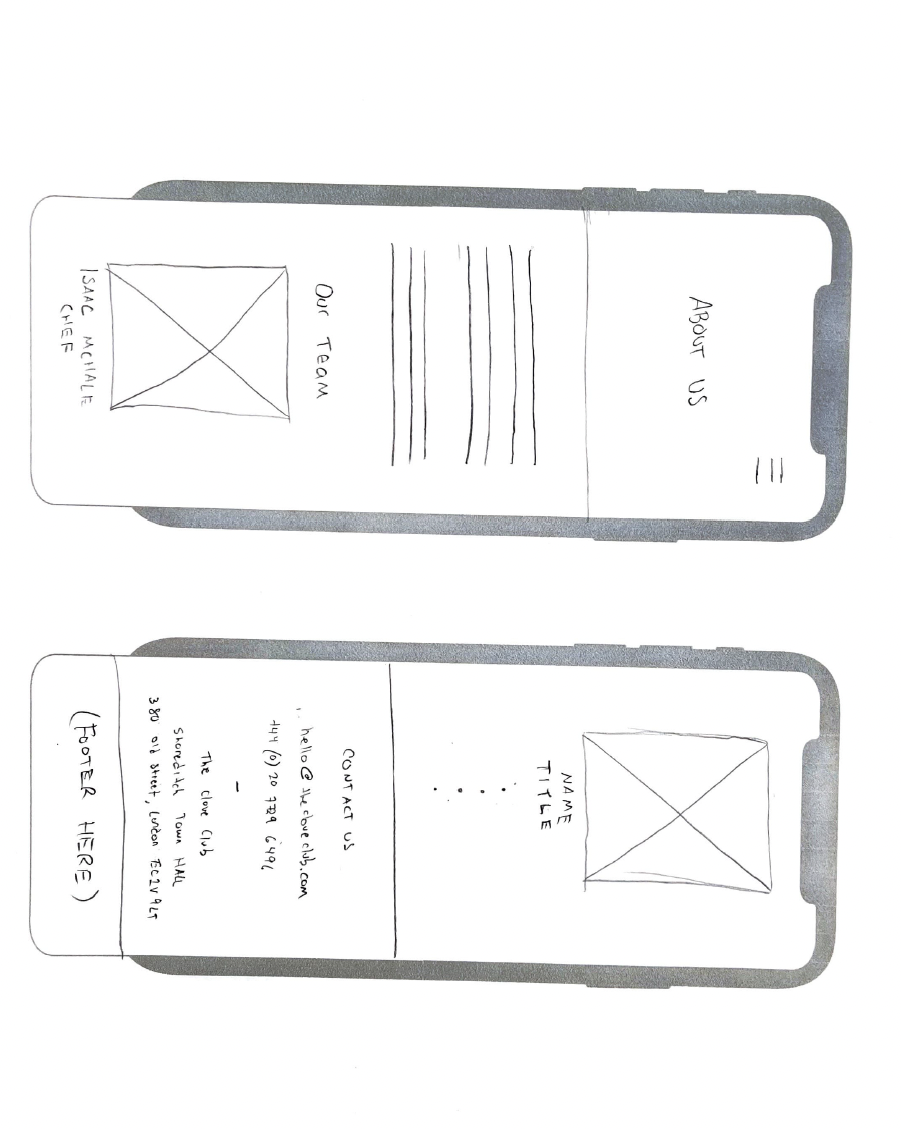
- About: trust-building story, chef/restaurant credibility, and experience-focused content.
Wireframes
Early structure · layout exploration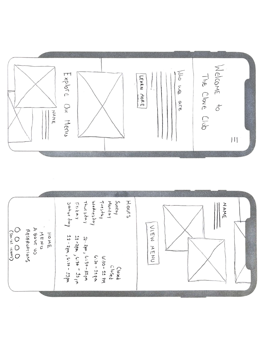
Results & Takeaways
- Better first impression: clearer positioning and reduced cognitive load for new visitors.
- Improved readability: accessible contrast, stronger hierarchy, and more legible typography.
- Higher engagement potential: visuals and CTAs aligned to premium dining expectations.
- Reduced friction: easier navigation and improved menu/reservation discoverability.